
Trying to support as many devices as possible the best way possible is a very daunting task indeed. You will usually need to provide a lot of different layouts, strings, or dimensions (among others) to make your app look great whatever the user’s device is. And then you start chaining resource qualifiers and testing which resource is being loaded by the OS can become a nightmare very quickly.
Here’s a trick I started using which seemed to work quite well. Create a string (the app name works well if you have an Action Bar) that you can display on-screen (or just throw into a Log or a Toast) that will quickly let you know from which of those very many /res folders your resources are being pulled out of.
For this demo, I have the following /res/values-xxxxx folders:
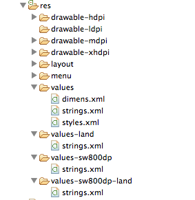
As you can see, there are strings.xml files in each of the configurations I want to support. Each of these files will contain whatever description we want to see on the device or in the Logs. In my case, I have custom strings for each form factor and orientation, which allows me to validate things easier. But this is particularly useful if the changes per form factor and orientation is subtle, such as dimensions.
Here’s what it looks like for phones:
 |
 |
And here are the outputs for tablets:
 |
 |
Each of the strings.xml files contains just these two strings (sample taken from /res/values-sw800dp):
<resources>
    <string name="app_name">MultiDeviceSupport - Tablet Portrait</string>
    <string name="hello_world">Hello world on a tablet!</string>
</resources>
Have fun debugging!